← Back to the sideshow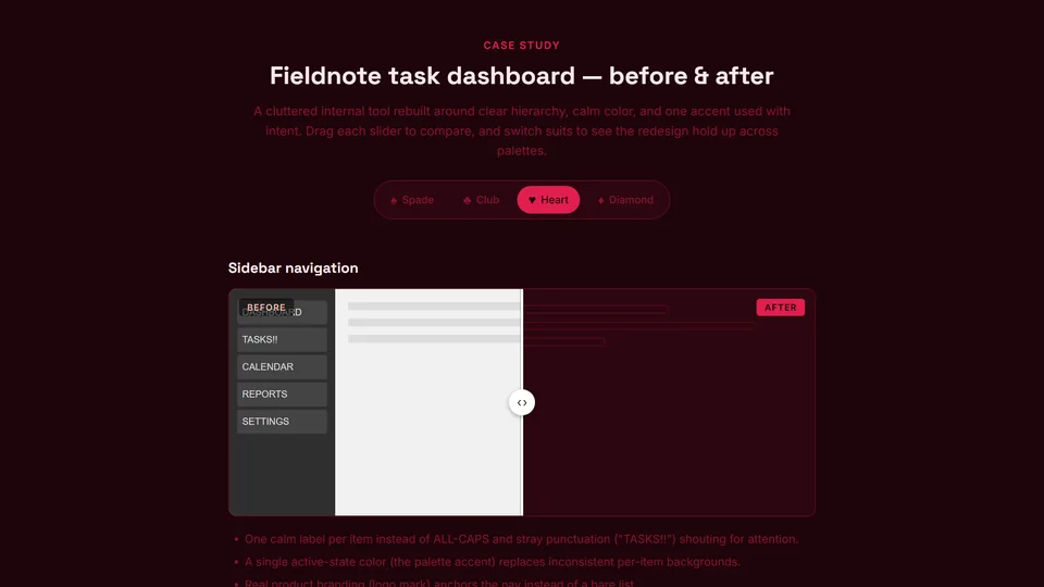
Example client work · Dashboard redesign
Fieldnote dashboard redesign
A before-and-after case study: a cluttered internal task dashboard rebuilt around clear hierarchy, calm colour and one accent used with intent.
The brief
Fieldnote is an example project: the kind of internal task tool teams live in all day and quietly put up with. The before state is deliberately familiar, with ALL-CAPS labels, stray punctuation shouting for attention and a different background on every menu item.
The goal was to make it calm and readable without losing anything people rely on.
What changed
- One calm label per item instead of ALL-CAPS and "TASKS!!".
- A single active-state colour, the palette accent, replaces inconsistent per-item backgrounds.
- Real product branding anchors the navigation instead of a bare list.
- The redesign holds up across all four suit palettes, from dark Spade to light Diamond.
How to read it
Each part of the case study has a before-and-after slider. Drag it to compare, then switch suits to see the redesign hold up in every palette.